
Loyalty cards can be forgotten in the depths of your purse or wallet. That’s why a well-created card can help your brand stay fresh in customers’ minds. The same can be said for membership cards – the right design can transform these into advertisements for your museum, club or gallery.
Be inspired by our 10 great loyalty card ideas and classic examples of membership card design.
1. Design Museum membership card
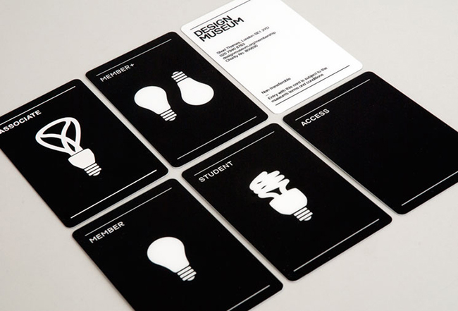
Image Source: Design Museum / Designspiration
The concept of these minimalist loyalty cards is a perfect fit for the Design Museum.
The museum has gone for a clever use of visuals, with different types of lightbulbs for different levels of membership – giving these cards a quirky edge.
The monochrome colour palette is not only sleek and sophisticated, it also makes the designs jump off the card.
It’s a simple artwork, but with bags of style. Fans of the museum would be proud to keep one in their purse or wallet to use each time they visit.
2. Speakeasy membership cards
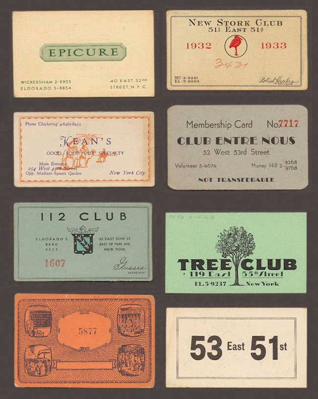
Image Source: Pinterest
Vintage and retro styles are alluring for many people. The history and yesteryear artwork of cards from bygone eras is fascinating.
It’s no different with these Speakeasy membership cards – used at establishments in midtown Manhattan from the 1920s.
Exclusivity is an interesting membership card idea. The mere suggestion there’s even ‘membership’ in your business can make customers feel special and unique.
Create something cool and exclusive, then reflect it in the design of your loyalty cards and you’re onto a winner.
3. Johnsons The Cleaners membership card
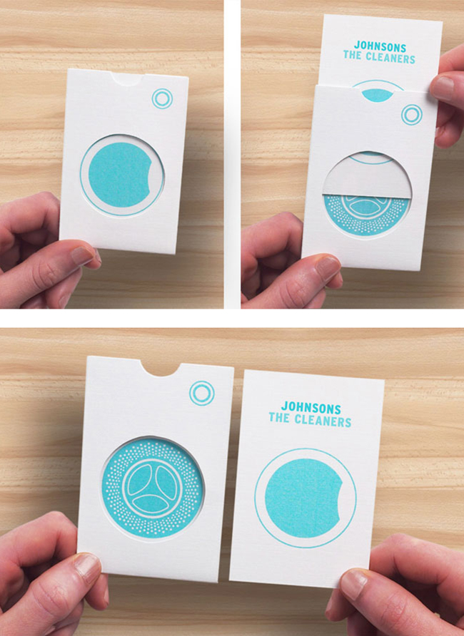
Image Source: Identity Designed
Johnsons the Cleaners shows us how brands have been reflecting what they do as a business in their loyalty card design for decades.
Its priority club membership card uses a conceptual sleeve design that plays on their line of business – laundry. When the card is in the sleeve, the machine is full and when the card is removed it’s empty.
This is an outside-the-box take on a loyalty card, that your customers are likely keep at hand.
4. FOTA Wildlife Park membership card
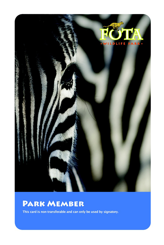
Image Source: Pinterest
This wildlife park in Ireland uses stunning photography to create an eye-catching membership card.
Again, this sticks to the idea that your card should reflect what you do as a business. It’s also a fantastic example of how impressive professional photography can be when used to its full potential.
Made unique with close-up photography, the card also incorporates the logo and name of the wildlife park – as well as who it is aimed at.
5. Cadbury’s Curly Wurly membership card
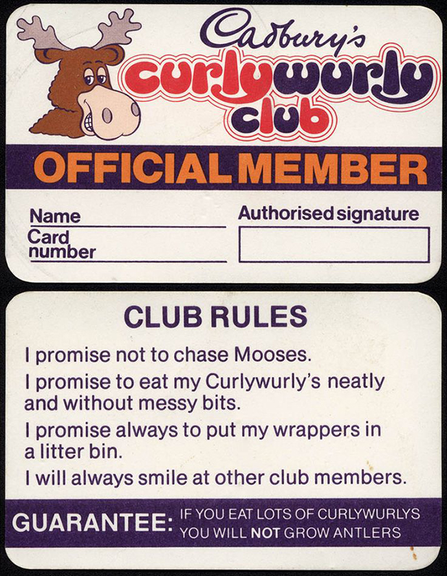
Image Source: Cadbury’s / Pinterest
This Cadbury’s Curly Wurly Club membership card from 1982 features the inclusion of the tongue-in-cheek ‘club rules’ and an offbeat ‘guarantee’ that makes it memorable.
Not only is it aiming for fun, which is exactly what the audience base for this card would be receptive to, but the membership card design is also on-brand.
Provided your branding is strong, take opportunities to be a little different as it can help you stand out from the competition.
6. Brandon Styles eVIP membership card
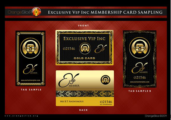
Playing on the style of high-end credit cards, this membership card for variety performer Brandon Styles will make anyone feel like a VIP.
Using a tiered system of both black and gold memberships, the cards offer extra value to the recipient, making them feel part of an elite group.
Introducing designs that offer different reward systems adds additional value to your brand and passes this onto your customers.
7. Caffe Nero loyalty card
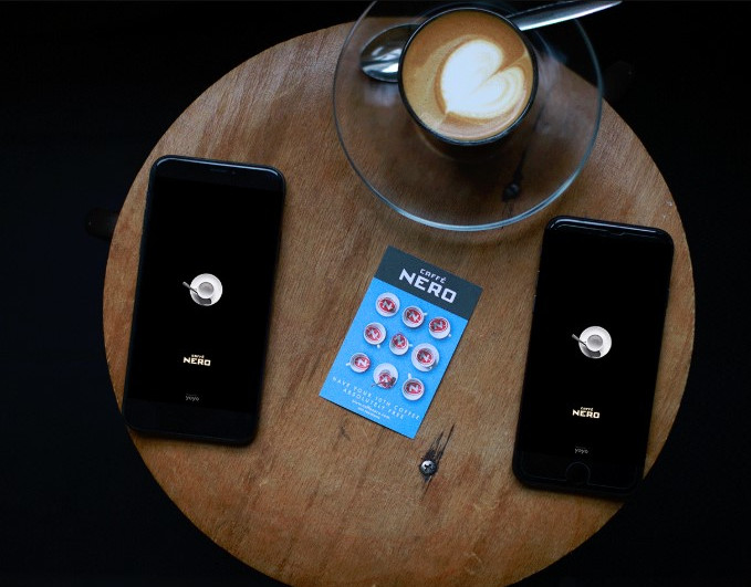
Image Source: Caffe Nero
While digital loyalty apps are perfect for smartphones, traditional stamp cards can still encourage repeat customers.
In fact, the most effective method of creating a reward scheme is to incorporate both digital and print cards.
Take Caffe Nero. Customers can still use their stamp loyalty cards in-store, then transfer the collected rewards onto the app.
That way, they can stay on-brand with their company colours and coffee cups, online and offline. After all, a physical stamp of recognition is sometimes more satisfying to the customer.
Nero uses a loyalty card design that’s bold and easy to understand – making it something that has stood the test of time.
8. Café loyalty card
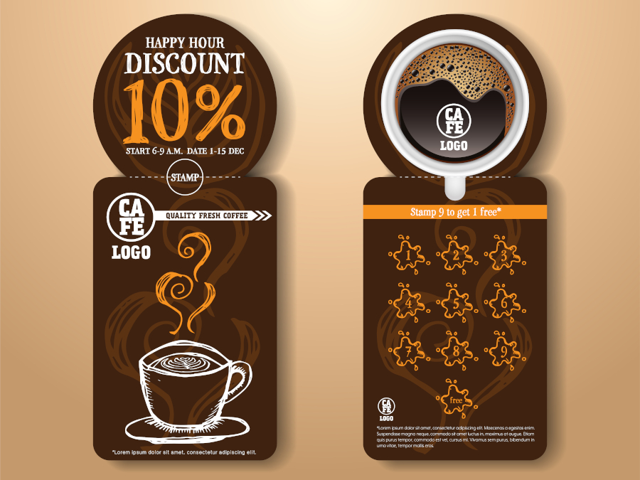
For smaller businesses, developing your own loyalty app might not be feasible. That means a well-designed stamp loyalty card is the best option.
On top of creating a card that is true to your brand, it’s important to give your business a competitive edge by offering incentives for your customers to stay loyal.
In the example above, each time a customer fills out and obtains a new loyalty card, they also receive 10% off a purchase.
Printed on a perforated edge, the card still retains its compact, wallet-sized shape once the discount has been applied.
9. Tate membership card
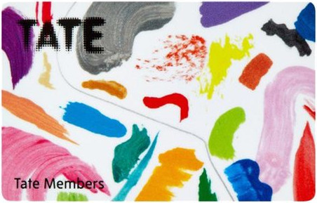
Image Source: Tate
If any organisation is likely to hold design at the core of its membership card artwork, it’s Tate.
The iconic gallery regularly changes its card artwork to reflect current exhibitions or spotlight features.
The example above is abstract and totally unique, making it impossible to lose in the throng of cards inside a purse or wallet.
While creativity is a sure-fire way of catching a loyal customer’s eyes, it’s important to stay true to brand values too. Though this card is perfect for the Tate, it would seem odd to members of the Uffizi Gallery.
10. World of Hyatt membership cards
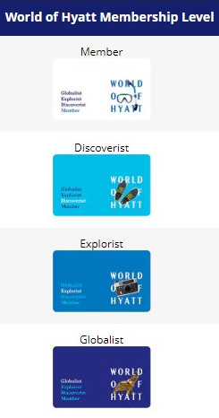
Image Source: Hyatt
The membership cards featured above from luxury hotel company Hyatt come in four different tiers, to appeal to all kinds of travellers.
Starting as a member, those who sign up are encouraged to collect rewards points to move up the rankings. These four designs evoke a sense of achievement each time a member reaches a new level and receives their card.
Membership cards don’t always have to be called just that either, the use of different nouns related to travel gives Hyatt a sense of authority and its members a sense of pride.


I particularly like the vintage membership card designs. I wouldn’t mind having them in my purse. Nectar cards, etc, are not as stylish.
Nectar cards are not stylish! I agree. Maybe that’s why I never actually use it?
Membership cards are great and do make you feel special and valued! Love the curlwurlys card 🙂
Yes, you do feel special when you have a membership card. Particularly love the history behind the speakeasy ones, but my favourite has to be the Design Museum. The simplicity yet original viewpoint is inspired.
I totally agree Lindsey. With a museum dedicated to design itself, it would be a good idea to have a quality design on their membership cards!
These are really sleek
Agreed, it’s a way to make your customer feel that little bit special, like they would be your priority. You feel like your a bit of a V.I.P with your membership card, plus it’s a great way to get customers to return. I save my Boots & Nectar Card points up all year & then treat my family at Christmas using my points 🙂
P.S so how do I get in the Curlywurly club?!
Hey Carmen. Unfortunately the CurlyWurly Club looks to be a thing of the past. However, all is not lost and there is actually a CurlyWurly club on Facebook that has 28 likes: https://www.facebook.com/pages/The-Curly-Wurly-Club/158887730814225
The iconography for the lightbulbs on the Design Museum membership cards looks great!